A book should not be judged by its cover, but the same does not hold for your professional event websites.
With the increase in the number of events happening globally, along with the added feature of attending them online from the comfort of one’s home, visitors these days have a lot of variety to choose from. Hence it becomes incredibly important for event websites to catch a prospective attendee’s attention the moment he or she lands on the event website’s homepage to sell tickets online.
There is a lot going on here, so let us take it down one by one.
First and foremost, why should the visitors attend your event in the first place? Why should they put their time and effort into attending your event instead of binge-watching their favorite Netflix show, if not attend another similar successful event? Your event website should convey to them the reasons as to why they should buy your tickets rather than get an OTT subscription.
Branding Your Event
To begin with, consider your event to be your brand, and your event website design to be the primary branding. No amount of celebrity and influencer marketing can beat incredibly unique and personal branding. The event website design does this job.
But what do we mean by event website design over here? Does it mean only fancy banners and eye-catching fonts and images? Or is there anything more to the layout? Of course, there is. While banners, fonts, and images can catch the prospective attendees’ attention, they are not enough to hold their attention.
There are other equally important elements that should be considered while finalizing the event website design. These elements enable the event website to speak directly to engage the attendees and help them decide whether or not to attend the event.
Tips For Designing Great Event Websites
We have helped event professionals create amazing event websites, and here is the checklist that helps in designing websites for events,
- While building your event website design, think from the perspective of the target audience rather than that of an event organizer.
- Fancy fonts, pretty images, and cool graphics are not all it takes to build a top-notch event website. All these components have to align with the theme of the event as well.
Pro Tip: You can publish your events with AllEvents and get a free customizable event website of your own. Below is an example.

Sell tickets to audience
15M event seekers visit AllEvents every month. Are your events visible to them?
Essential Elements For Event Websites
Date & Time
Mention the dates and description for event at the beginning of the event website page so that the moment website visitors land on the homepage, that is the first thing he or she sees. This gives them a clear idea of the event’s timeline and helps them plan better. Make sure the time zone has been correct.
Putting up a “save-the-date” button along with it can result in the prospective attendee signing up for the event then and there without having to search for the registration page.
Event schedule:
Putting up the entire schedule of the event, if possible, is also a great idea, mostly when the event is going to take place over a period of time.
Not everyone will be interested in attending all the sub-events happening, therefore, it helps them decide which ones they would want to attend and attendees travelling from different cities, states, or even countries can plan their boarding and lodging accordingly.
FAQ section
The FAQS section can also be a great addition to your event website page. Answer all the general queries a prospective attendee can have within this section in order to help them streamline their decision-making process.
If it is impossible to put all the FAQs on the homepage, at least provide a link to the FAQ section in the drop-down menu at the top of the page or in between or after the main text.
Images and videos:
Using images and videos from the previous year’s event can serve as great tools to give the potential attendees an idea of how it feels to attend the event and become a part of your community. This gives them a perspective of what they are getting into before attending or registering for the event.
Use images to show off your event venue, and cool activities are done in the previous years’ events to make a solid pitch for your event.
Guestlist
Providing a list of featured guests, speakers, or performers along with their credentials is an excellent add-on to your event website page. This gives the potential attendees an idea of who they would be listening to or watching.
Pro tip: Keep a watch on pre and post event engagement ideas to boost lovability of your event.
Bonus Tips on Creating Event Websites
If there is a personal story about the event, like the history of how the event came into existence or why the venue or location is special to the event, then do share it in brief because, believe it or not, people want to hear what makes you unique.
Also, providing such a personalized story helps in connecting them to the event on a personal level. It makes them believe that it is indeed a very niche event they are attending and not something that is just happening off the rack.
Knowing that they will be attending a very special event will make them even more excited to be a part of it.
- Add a section of pre-event survey questions to your event website page or provide a link to a separate page for the same. Check out the types and benefits of pre and post event survey questions.
- Create appealing and story telling event description and content on website. You can use copy.ai tool to generate copy
- Add an email subscription option which the visitors can sign up for. Paired with great event invite templates, these update emails can serve as a constant reminder of your event and its deadlines.
Pro tip: On AllEvents event page visitors can subscribe to your event page and get notified whenever you publish or create a new event.
How to Create Your Own Event Website
Creating a website with all these features can be a difficult task, especially if one is not into coding or is just picking up his or her career as an event organizer and does not have the funds to hire a coder.
Also, sometimes the same organizer will be organizing multiple events at the same time, and promoting them all at once while keeping track of the main website needs a lot of coding work.
But there are many online event management software that can come to the rescue in such situations.
Certain platforms, like AllEvents, let event organizers create their websites for free once you publish your events.
Also, every time the organizer publishes a new event on the event listing website, the event also gets added to the line-up on their own event website. Therefore, all that the organizers have to do is publish events on the event promotion platform without having to make changes on their own websites by themselves, because the platform automatically adds the newly published events to the organizers’ personal event website.
Create your event website
Get a professional event booking website that runs on your domain & promotes your brand.
Top Event Websites Design Examples
Let us now take a look at some of the best event websites that can serve as great examples when designing your own event website.
1. TED 2022
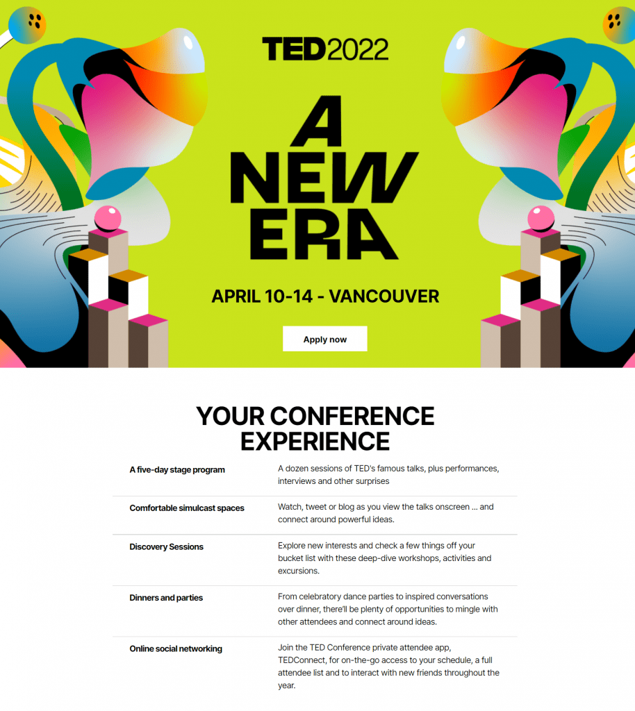
The TED Conference is undoubtedly one of the most important events that happen every year.
- The moment you land on this event website’s homepage, you are greeted with a catchy graphic background. What makes it even more personalized is the theme of the year “A New Era” put right in the middle in big fonts.
- Below the theme, the organizers have provided the visitors with the dates and location of the event along with an “Apply Now” button just below it. Clicking on this option directs one to the different membership options and benefits listed neatly in a tabular form.
- Scrolling down one is able to find the entire 5-day schedule accompanied by images from previous events.
- At the bottom of the page is a brief about this year’s venue and how it has been designed to make it a perfect fit for hosting the TED Conference.
- Just above this is the classic email subscription option to stay up-to-date with news about TED 2022.
2. PH DESIGNS
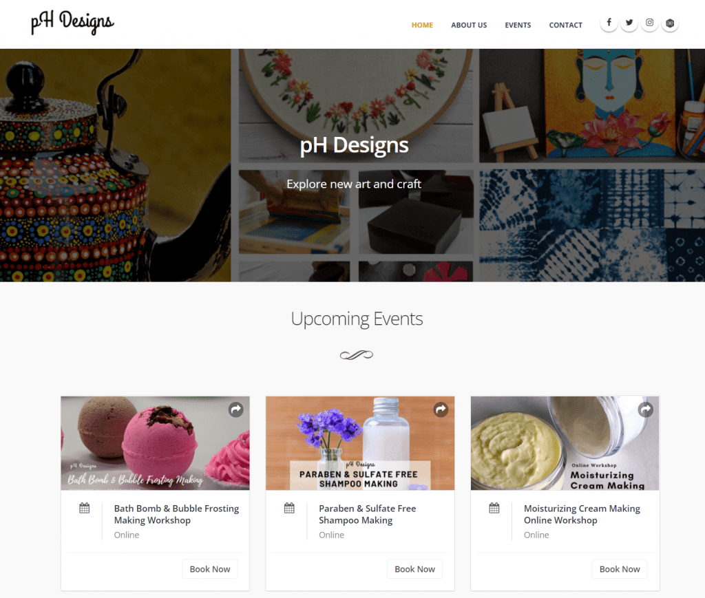
Here is an example of event website that used template of event plugin for their website.
- Simple and artistic banner at the top of the event website page.
- All upcoming events are listed on the homepage, along with pricing details and the “Book now” option to buy tickets.
- Website automatically gets updated with the AllEvents event plugin.
3. EPICURRENCE
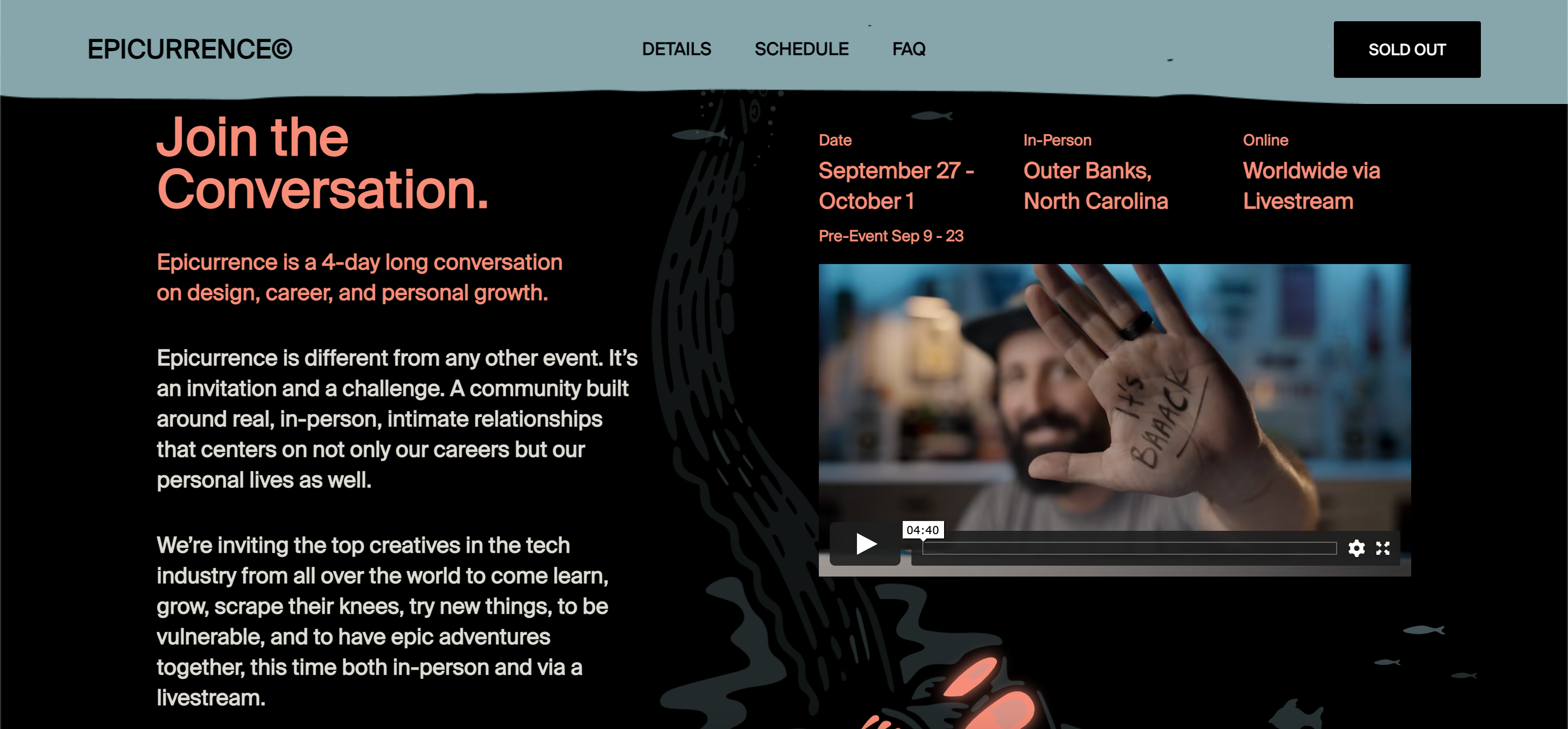
-The banner on the event website homepage has moving graphics in the background with a popping logo for the event.
-Scrolling down one finds information regarding the dates for the event, in-person event location, and online streaming option.
-Just below this is an introduction video for visitors to the event website.
-Entire detailed schedule is very aesthetically provided on the homepage along with pictures of the in-person venue.
-An added feature on this website is the FAQs section on the homepage itself.
4. COACHELLA
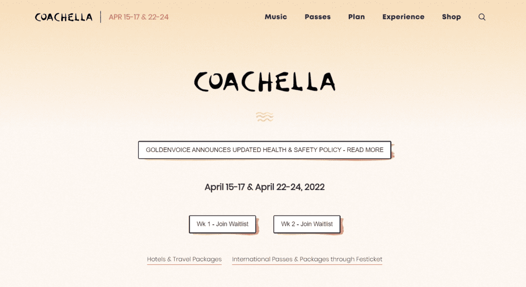
-Simplistic yet catchy background design.
-Dates for Week 1 and Week 2 are provided right at the center of the page.
-Below the dates is a direct button link to join the waitlists for Week 1 and Week 2
-Direct links to Hotel & Travel Packages and International Passes & Packages through Festicket.
-The drop-down menu at the top of the event website is easy to navigate and provides all the information about the event along with shopping options.
5. VANITY FAIR’S COCKTAIL HOUR

-Unique and artsy background design going well with the theme of the event.
-Scrolling down one finds the entire list of celebrities to be featured in the event along with the celebrity host.
-The entire schedule for Acts 1, 2, and 3 is also available.
-FAQs direct link at the top of the event website page.
-Minimalistic design gives this sophisticated event’s website a sophisticated look.
6. THE LIVE EXPERIENCE
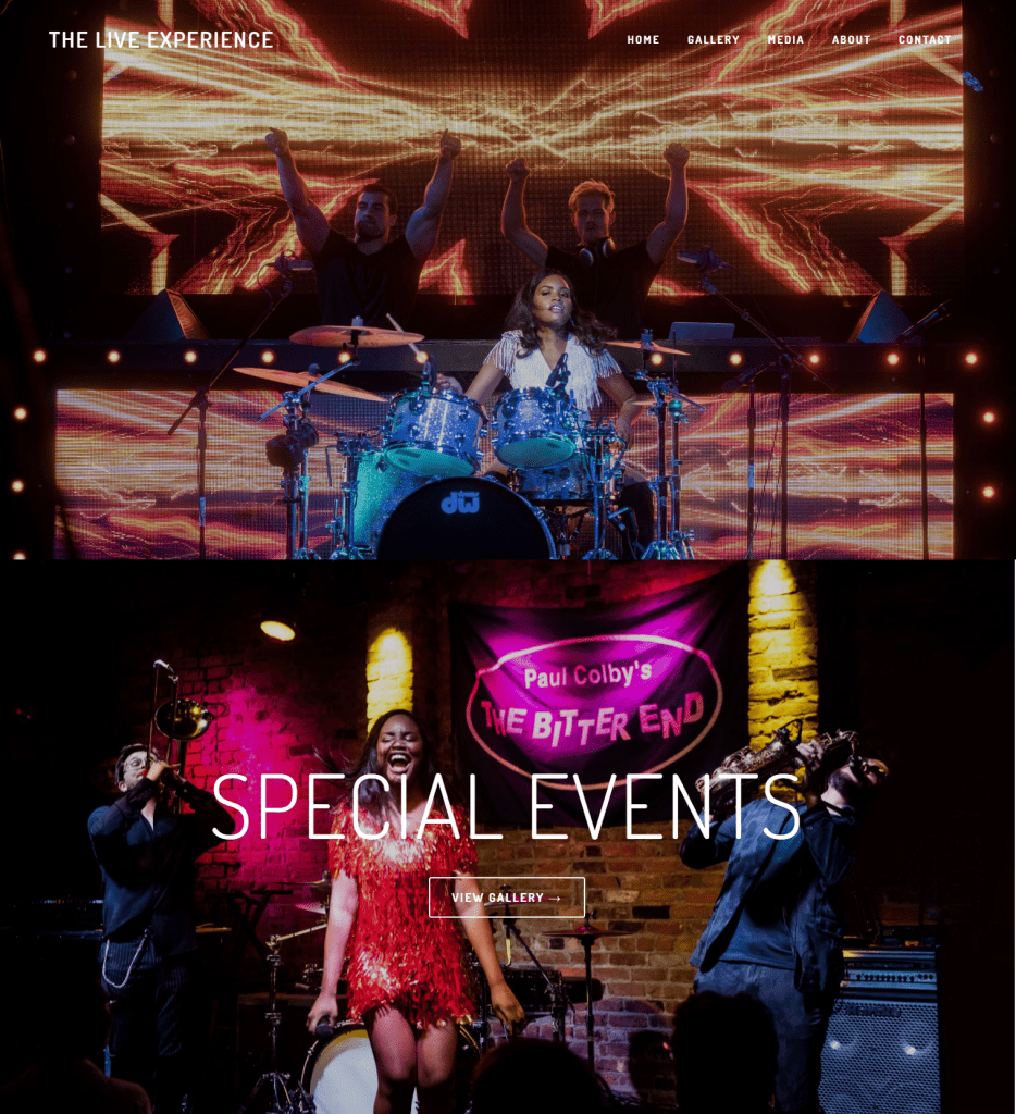
-This event website’s home page is full of video covers of previous live performances at corporate and special events, and band and DJ combos serving as testimonials inviting clients to work with them.
Sell tickets on website
Copy code – Paste on your website – Done
You can start selling tickets within 60 seconds
7. 2ND STREET FESTIVAL, RICHMOND
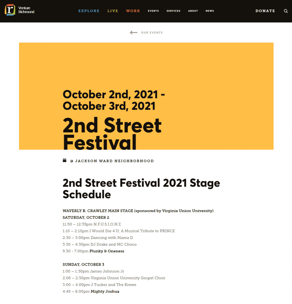
-Dates on the banner at the beginning of the event website page itself.
-Highlights of the homepage:
- 2nd Street Festival 2021 Stage Schedule
- Health & Safety at the 2nd Street Festival
- 2nd Street Festival FAQs
- Official Festival Poster Artist
- Artist Row Vendors
- Jackson Project Weekend Activities
- Radio One’s “2nd Street MIX” Weekend
-The homepage also contains pictures and a video from previous years’ events.
8. BRAND NEW CONFERENCE
-The theme of the event changes every year.
-This year’s theme is Western since the event will take place in Austin, Texas.
-The themed banner is eye-catching and includes the dates for the event.
-The “Register” button directs to the registration page.
-Below the “Register” button are the various pricing options.
-The event website page is short and minimalistic, but at the same time it is heavily themed.
9. DREAMFORCE
-The cartoon banner with live snowfall gives a complete dream sequence feeling, matching with the brand of the event.
-Scrolling down gives the list of speakers along with their photos and credentials
-The FAQs on the homepage are presented in an animated format.
-Every now and then on the website, one finds the “save-the-date” option, mostly after the end of every sub-section on the homepage.
10. MERIDIAN
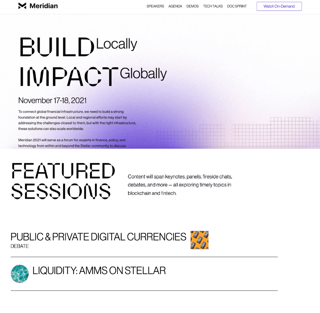
-Their message “Build Locally, Impact Globally” is put right at the top of the event website page.
-Just below are the dates for the event.
-The list of featured speakers has been provided with their photos and credentials.
-List of Featured Sessions has been provided as well.
-They have provided direct links to access their Demo Videos and Tech Talks.
Final Words –
Now that you have understood all the key components of an event website, have found tools to create your own website along with some beautiful event website design examples, the only thing left is- Taking Action. All the best!
Abhishek is a content marketer who specializes in ticketing and event trends happening throughout the globe. He feels that event marketers should easily find the information they need.
Hence, he is responsible enough to gather information and deliver the relevant guidelines to planners throughout the event industry.
